
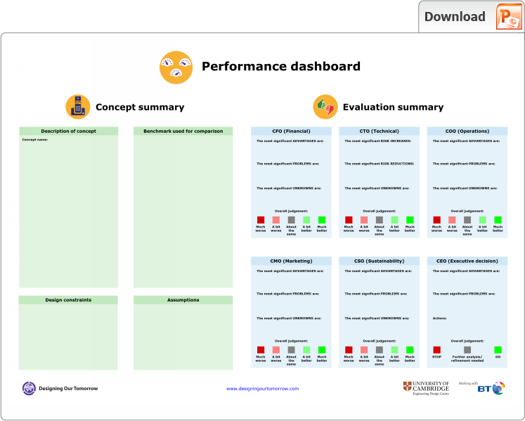
Performance dashboard
| |
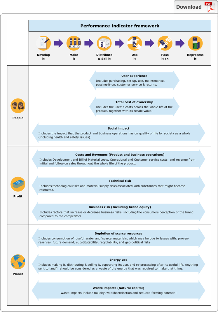
What?The performance dashboard is a tool for early-stage evaluation of concepts providing an integrated summary of people, profit and planet success criteria, applied across the whole life of the product. The performance dashboard is based on a performance indicator framework, which is described below. | |
 | |
|
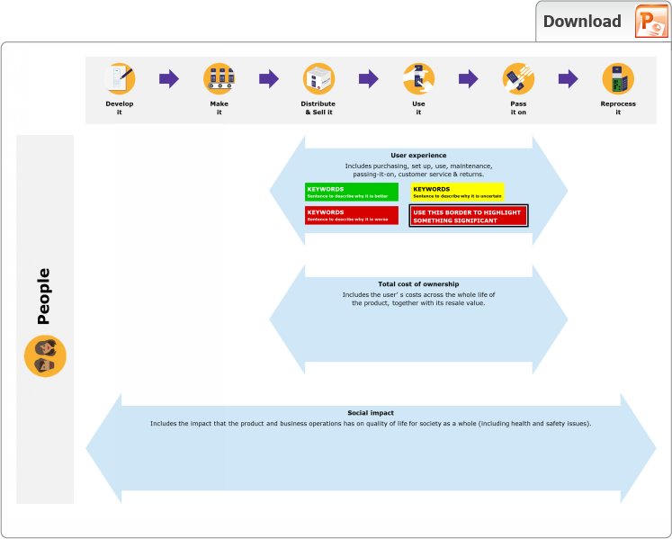
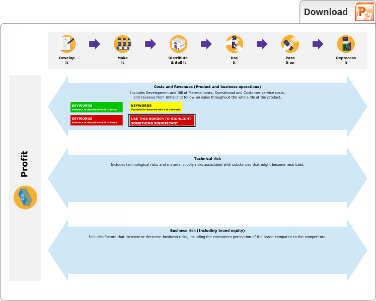
The performance dashboard is a PowerPoint file that enables evaluations of 'Better', 'Worse' or 'Same' to be inserted into the relevant spots within the performance indicator framework. The evaluations are also summarised according to the Chief 'X' Officer perspectives. The contents of the PowerPoint file are shown as images below. | |
| |
 | |
 | |
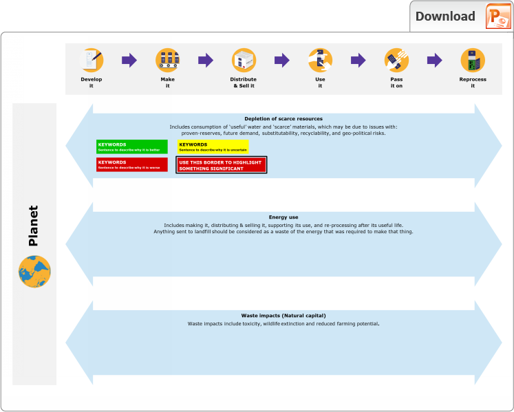 | |
Why?It's all too easy to come up with an idea that makes one aspect of the performance indicators better, but unintentionally makes another aspect worse. The performance dashboard provides a structure that helps you think through all of the issues. Once completed, it can help to inform decision-making by bringing all of the evaluated strengths and weaknesses together in one place. How?To use the performance dashboard, you need to:
The dashboard can be completed electronically using this PowerPoint template, although we recommend you print this template as a set of large posters to enable a group of people to evaluate the proposed concept using coloured pens. Describe the concept for evaluationSketch the concept and describe its key features in sufficient detail to support the evaluation. As the evaluation progresses, you will inevitably come up with ideas for improving or modifying the concept. Using evaluation to inspire creativity and iterative design is encouraged. However, you must be careful to review the entire dashboard each time the concept is updated. It's all too easy to modify the concept halfway through the process, without realising that this should change previous evaluations that have been made. Agree the benchmark for comparisonIt is extremely difficult to make an early-stage judgement of a concept according to whether it is good or bad with respect to a particular performance indicator. However, it is much easier to make all evaluative judgements by comparison with an agreed benchmark product. For example, it is extremely time-consuming to calculate the amount of energy required to manufacture and assemble an ICT product. However, for early-stage evaluation it is faster to judge whether it would require more or less energy to manufacture compared to the existing product, based on whether it has more or less electrical components. Set the overall objectiveThe dashboard inevitably generates and captures a large amount of information, so it is important to stay focused with respect to an overall objective for the concept, which should match the top-level priorities of the business. An example objective might be to make a step reduction in the energy consumed through the whole life of a product, without undermining any of the other performance indicators. Work through each phase of the whole life of the productStarting at the top of the 'Develop it' column, work downwards in order to judge whether the proposed concept is better, worse, or the same as the benchmark, or whether this is unknown. These can be captured by writing on printed versions of the dashboard using coloured pens, or using the coloured boxes provided within the PowerPoint template. Having completed 'Develop it' repeat for the remaining columns: 'Make it', 'Distribute & sell it' and so on. Judging early-stage concepts inevitably requires making assumptions, these should be recorded in the box on the first page of the dashboard. For early-stage evaluation, the first step only indicates the direction of better or worse, it is not necessary to try and define exactly how big the difference is. It is much more important to think about how the design could be changed in order to mitigate any of the 'worse' factors. Furthermore, there is no merit in spending large amounts of time determining a precise evaluation for one aspect of the dashboard, when another aspect might reveal a 'deal-breaker' problem. Set priorities and summariseNow, take the first row of the dashboard 'User experience' and look through all of the judgements that you have made in order to identify and prioritise the most significant impacts. Highlight the biggest positive and negative impacts by drawing a thick line around the corresponding Better-Worse cards. Also highlight any significant 'unknowns'. Then, repeat for 'Total cost of ownership' and 'Social impact', and finally come to an overall conclusion as to whether the the Chief Marketing Officer, would think the proposed concept was better or worse than the benchmark. You can represent this final judgement as a range, in order to account for the 'unknown' factors. Repeat this process for the remainder of the dashboard in order to produce summaries for the Chief Financial, Technical, Operations and Sustainability Officers. Finally, review the overall objective as defined within the 'design constraints'. Plan next stepsPlan the next steps, by asking the following questions:
|
|
Feedback
We would welcome your feedback on this page: